When I joined Cloudsine, the brand told one story: web security, friendly, approachable, a little generic. The logo had a cloud and waves. The palette was teal. It made sense for what the company had been.
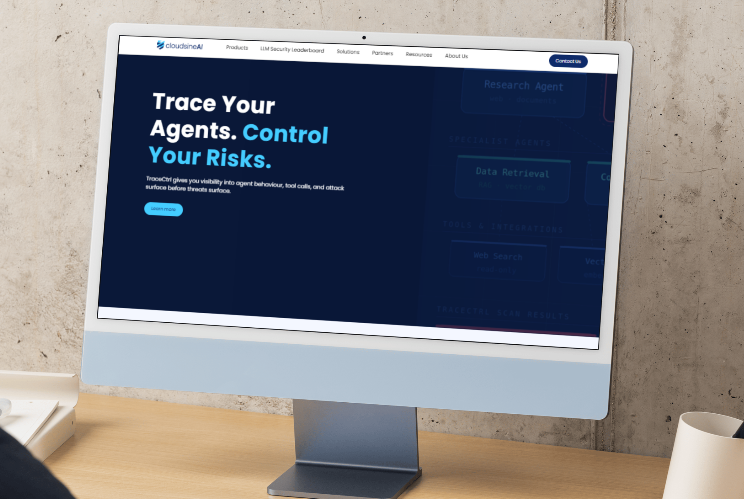
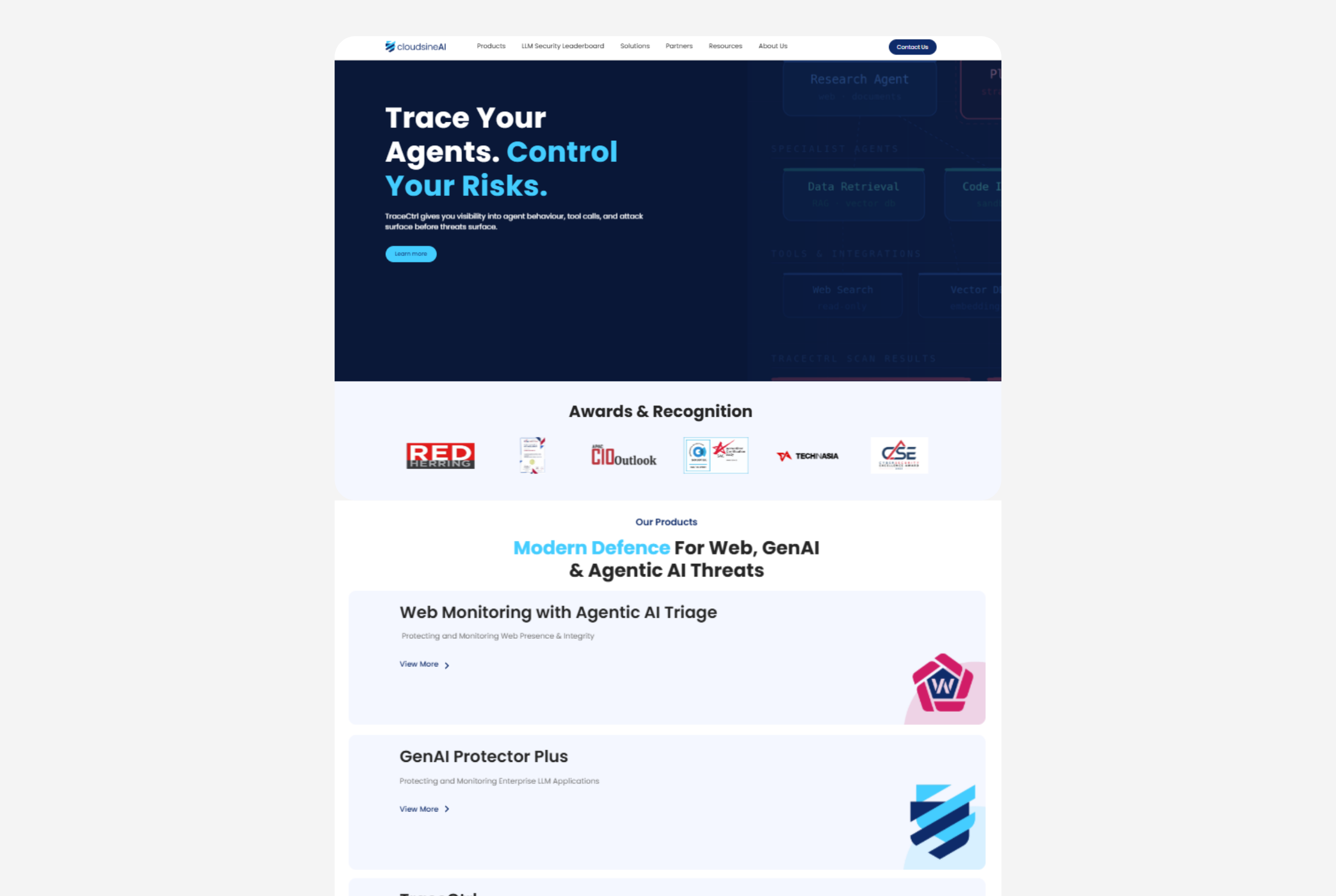
But by 2024, the company was moving somewhere new — into AI security — and the brand wasn't coming with it. When we started talking about generative AI products, the visual identity said something completely different about who we were.
The disconnect wasn't subtle.
The question wasn't whether to change. It was how much.
A full rebrand would have meant starting from scratch — new name, new equity, new recognition to rebuild. But a surface-level facelift would undersell what was actually happening: a genuine strategic shift, not a product add-on. We needed something in between.
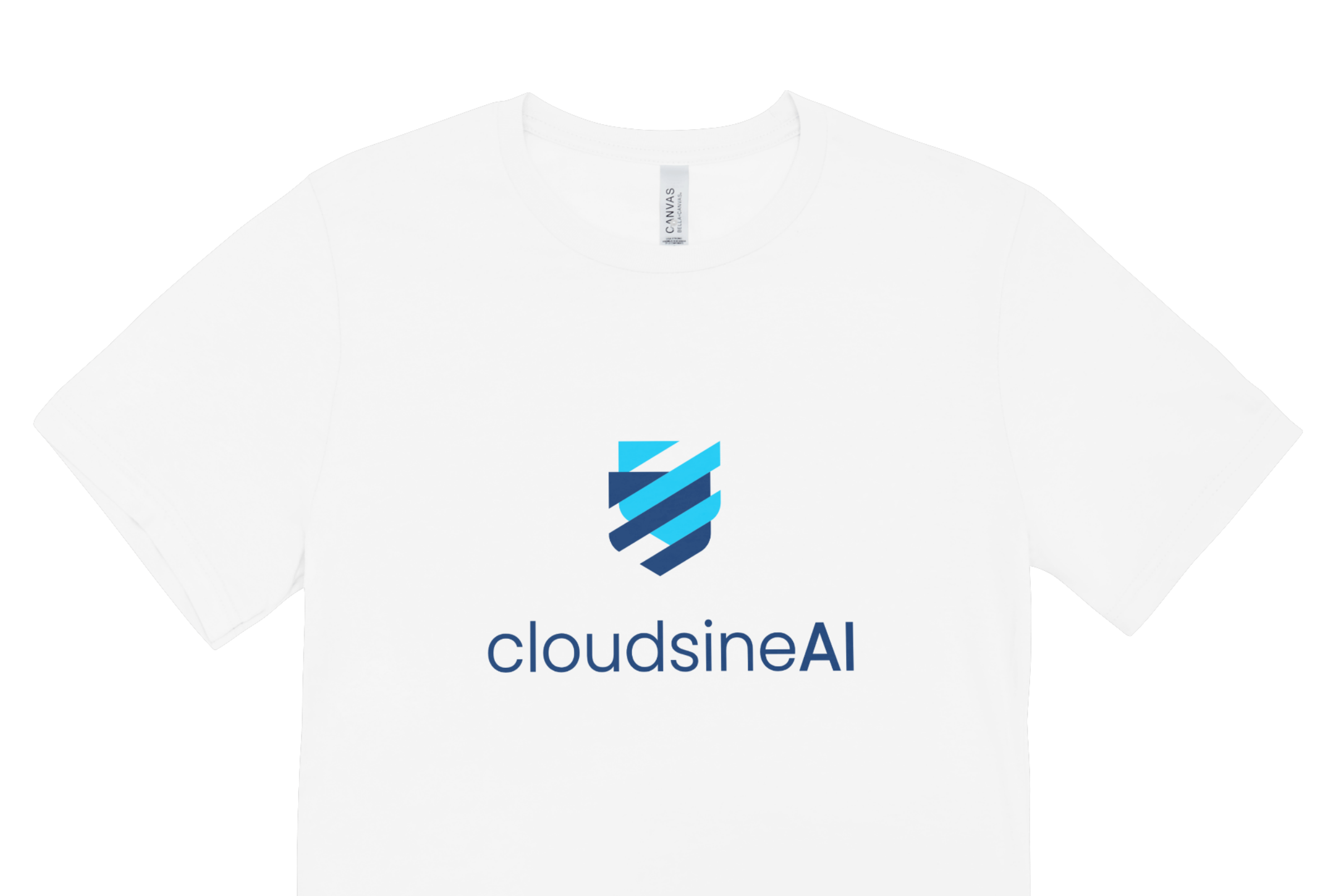
In conversation with the CEO, we landed on a clear principle: keep the name, change the story. "Cloudsine" had recognition worth protecting. Adding "AI" was a signal, not a disguise.
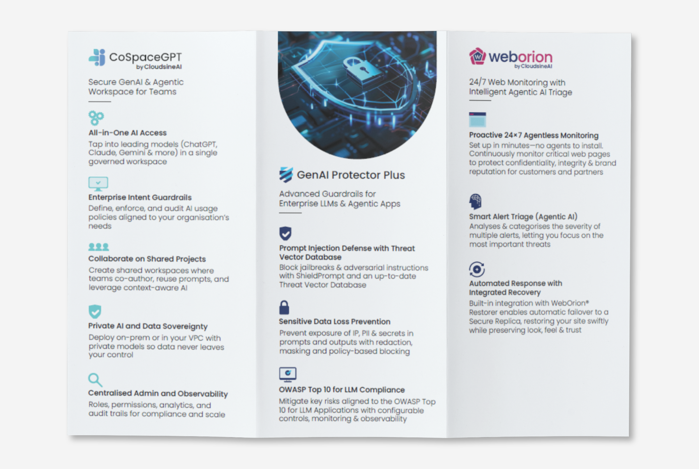
From there, I coordinated the end-to-end execution: a freelance designer on the logo, a web agency on a full site rebuild, and an SEO agency to make sure our new positioning showed up when people went looking for AI security solutions.